Rusted Not Busted: Australian House Prices
Yesterday’s speech by RBA head of economic analysis Tony Richards included this chart of the various series for Australian house prices. Looking at the level rather than the growth rate of house prices drives home the point that national house prices have been holding their own (although as previous posts have stressed, this conceals important differences between the capital cities).
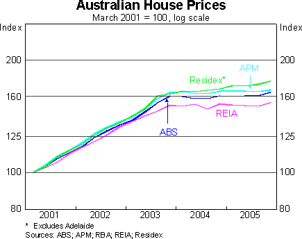
Needless to say, this is a very different outcome to the doomsday scenarios that were floated not very long ago, which promised national economic ruin on the back of a collapse in house prices (scenarios that are still getting a run in the US context). While the Q4 national accounts were painted as soft on the back of the headline numbers, real household consumption expenditure rose nearly 3% y/y, gross national expenditure rose 4.4% y/y and real gross domestic income rose a stunning 5.2% y/y.
posted on 03 March 2006 by skirchner
in Economics
(6) Comments | Permalink | Main
|

Comments
Stephen,
Do you know if this is similar to UK’s experience? The argument I’ve heard a couple of times here in the states is that the US housing market is a year or two behind the UK and Australia cycle.
Chris
Posted by cb on 03/04 at 03:19 AM
Never mind, morgan stanley addressed the issue today.
Posted by cb on 03/04 at 07:57 AM
I have only seen the abstract for the MS study. I would argue that Australia’s experience provides a very good lead on how things will play out in the US.
Posted by skirchner on 03/04 at 02:02 PM
Come on Stephen, this is a nonsense post and you know it!
The national house price figures (and indeed the national accounts) are completely distorted by the resources boom. If you want a true picture of the aftermath of a housing boom you need to look at what’s happening in NSW and Victoria in isolation, and exclude the resource boom states of WA, NT and Qld.
Unless the US and UK are counting on having a rocket strapped their economy like this…
http://www.rba.gov.au/Speeches/2006/_Images/020306_so_graph4.gif
...their post housing boom hangover is likely to be quite different to the Australian experience.
Posted by .(JavaScript must be enabled to view this email address) on 03/05 at 06:46 PM
Sydney and Melbourne effectively dominate the above series because of their large weight and are responsible for the flattening in the level shown above, so these series are actually a much better reflection of what is happening in NSW and VIC than the resources states.
Posted by skirchner on 03/05 at 07:49 PM
Whatever the weighting you have to agree that chart would look worse if it excluded the resource states like WA. I believe Perth is currently experiencing double-digit growth per *quarter*.
You can’t argue that “Australia’s experience provides a very good lead on how things will play out in the US” because the US economy is unlikely to get a big external boost just as its housing market is coming off the boil.
If you want to examine a housing market that is leading the cycle (and was not given a kick along by external factors) look at Sydney.
Posted by .(JavaScript must be enabled to view this email address) on 03/05 at 10:47 PM